Visual Culture视觉文化 · Analysis分析
The Role of Negative Space in a Small Screen
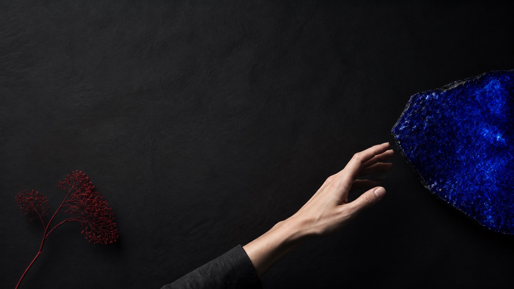
Empty space is not an absence of design; on a small screen it can protect a gesture, a face, or a question from visual crowding.
Key takeaways核心要点
- Use empty areas to separate story-relevant information rather than to mimic luxury branding.
- Preview at the smallest intended width before treating a composition as clear.
- Let negative space create a pause without withholding necessary orientation.
On a phone-sized frame, almost every object competes with the next one. A background pattern, a caption, a hand, and a face can collapse into the same small area. Negative space is one way to give an important element room to register. It is not simply blankness. It is the deliberate decision not to fill every portion of a composition with equal visual pressure.
That decision has narrative consequences. A clear area around a person can make their hesitation visible. An open stretch of floor can make an arrival feel late. A pause between interface controls can prevent the viewer from mistaking one action for another. The space earns its place when it makes a relationship easier to read.
Small screens make hierarchy physical
In a large frame, viewers can scan several details at once. On a small screen, their eyes often follow the largest contrast or nearest edge. This makes placement as important as beauty. A hypothetical scene of two siblings arguing in a kitchen may need only one face and one active hand in the first shot. Trying to show the full room, both bodies, food on the counter, and a new message on a device can turn a specific conflict into visual noise.
Negative space can create a path from one element to another. It may be a plain wall between two figures, a darker field around a bright object, or a clean margin around a block of text. The viewer does not need to notice the technique. They simply need to have enough time and contrast to recognize what is changing.
Leave room for a question, not a missing fact
There is a difference between withholding a conclusion and withholding basic orientation. A frame may hold back the reason someone is upset while still making clear who is present, where they are, and what action is underway. Negative space can heighten that uncertainty by isolating a face or object, but it should not make the scene impossible to enter.
Test this by describing the image in plain language after a quick viewing. Can a viewer say what the immediate situation is? Can they identify the detail that has been given weight? If neither is true, the composition may be sparse without being purposeful. Adding a single anchor—a doorway, a visible hand, a line of text—can restore context without crowding the frame.
Build pauses into movement
Empty space is especially effective when a story moves quickly. A tight sequence of cuts benefits from a moment in which the eye can settle. That pause can prepare a reveal, mark a change of location, or let an earlier detail return. It need not stop the story. A person moving through a clean corridor, for example, can carry tension precisely because there is no extra visual information competing with their direction.
The timing matters as much as the shape. An open composition that lasts a fraction of a second may be felt only as a flash. The same composition held a little longer can become an invitation to notice. Review at actual playback speed and at reduced resolution; a deliberate gap in a design file may disappear in use.
Treat space as an active choice
Negative space is not automatically refined, emotional, or modern. Its meaning comes from what surrounds it and what it allows the viewer to do. A dense scene can be right for confusion, abundance, or shared activity. An open scene can be right for attention, distance, or uncertainty. Neither should become a default aesthetic pose.
When space is doing its job, it does not announce itself as emptiness. It creates enough quiet for the story’s active detail to be seen, and enough structure for a small screen to carry more than one idea at a time.