Visual Culture视觉文化 · Explainer解读
The Difference Between Style and Signal
Style shapes an image’s character; signal tells a viewer where to look and why that detail matters now.
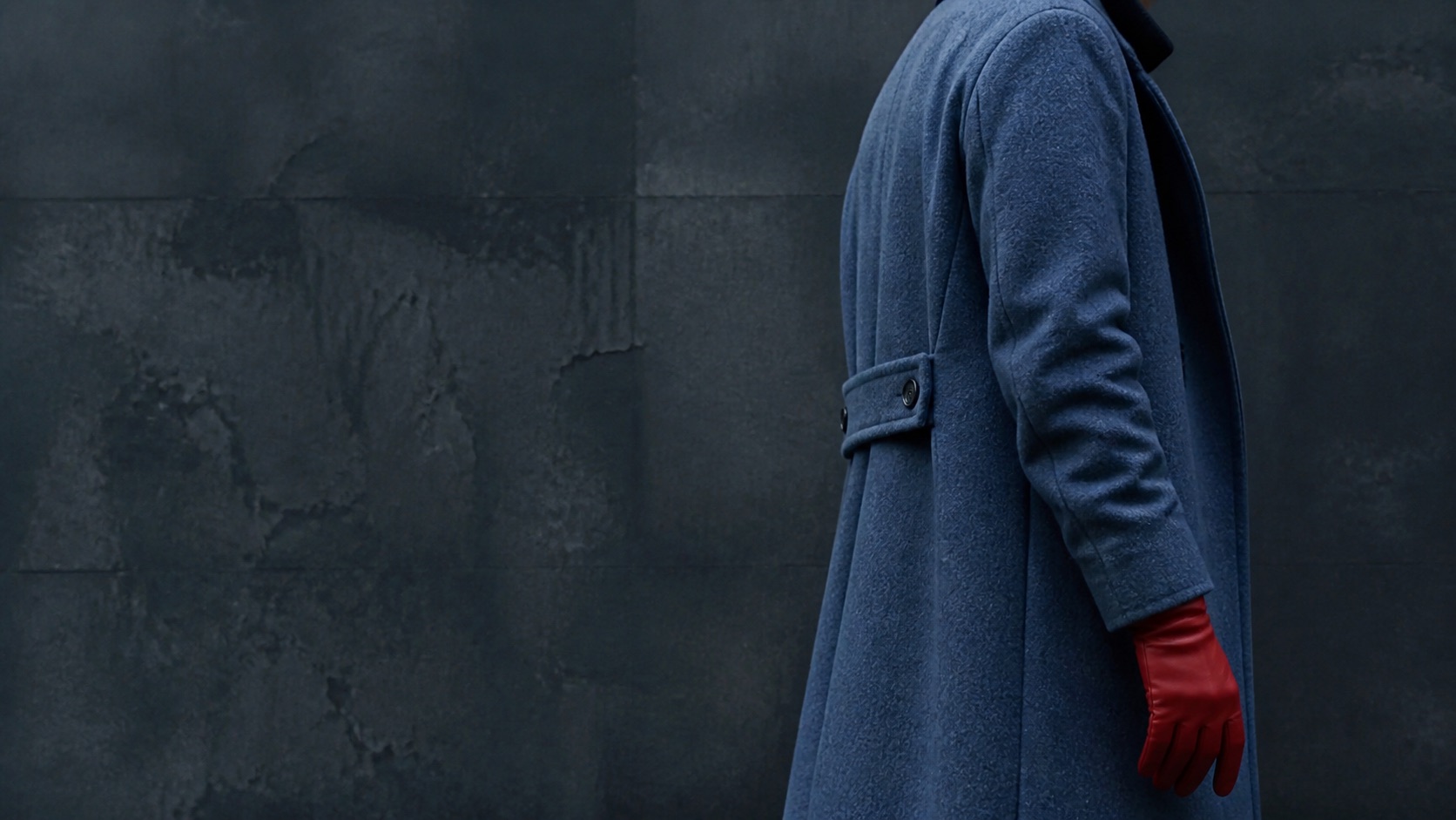
Key takeaways核心要点
- Style describes the character of a presentation, while signal directs attention within it.
- A clear signal can be quiet; it need not become a graphic instruction.
- Test whether an audience can locate the important relationship before adding more decoration.
“Style” is often used as a compliment, but it is a broad one. It can refer to color, line, texture, costume, type, editing rhythm, or the general feeling of a piece. A signal is narrower. It is a choice that helps a viewer identify what deserves attention at a particular moment. A saturated coat in a muted crowd, a pause before a button changes state, or a repeated sound paired with a doorway can all act as signals.
The distinction matters because an image can have a confident style and weak direction. Viewers may remember the surface while missing the relation the story needs them to read. Conversely, a plain image can be highly legible if its arrangement makes the necessary information available at the right time.
Style creates a field; signal creates a path
Think of style as the conditions of looking. A restrained palette may make a story feel contained; a rough texture may make a setting feel handled, temporary, or tactile. These choices establish a field in which attention moves. Signal is the path through that field. It tells the eye, quietly or emphatically, which contrast, gesture, object, or absence should be processed first.
Consider a hypothetical sequence in which a delivery worker enters an unfamiliar apartment. Warm lighting, patterned wallpaper, and a carefully arranged shelf might establish style. But if the story depends on a cracked picture frame by the door, the frame needs a signal: placement, focus, a brief hold, or a later recurrence. Otherwise it remains one attractive part of the room. The visual language has not failed; it simply has not yet carried the story’s priority.
A signal does not need to shout
Designers sometimes compensate for weak direction by adding contrast everywhere. Strong color, exaggerated motion, and large type can create a competition in which nothing feels selected. A useful signal can be smaller. It may be the only still object in a busy composition, the only face not looking toward an exit, or a clean pocket of light around a hand.
The right amount depends on how much the viewer already knows. Early in a scene, a clearer cue may be fair because the world is new. Later, when a pattern is established, a subtle variation can carry more weight. The goal is not to measure a universal level of emphasis. It is to match emphasis to the information load of that moment.
Review at the speed of use
Signals are often evaluated on a paused screen, where every detail can be admired. That can hide a practical problem. Watch the scene at its intended pace and viewing size, then ask a concrete question: where did the eye go first? A second viewer may notice something different, which is useful evidence rather than a verdict. If the intended relation is consistently missed, revise the composition before adding a new layer of style.
It also helps to remove one element at a time. If the signal disappears when a small shadow, crop, or color contrast is removed, that element is doing meaningful work. If the story remains clear after several decorative changes are stripped away, the remaining structure may be stronger than it first appeared.
Use both with different responsibilities
Style can make a body of work feel coherent and memorable. Signal can make an individual moment readable. They should cooperate without being asked to do the same job. A consistent surface cannot rescue a missed story beat, and a loud cue cannot create an identity by itself.
The most durable visual decisions make the division feel invisible. A viewer experiences a particular world, finds the important detail inside it, and moves on without being instructed to admire the system. That is enough: the image has character, and its character has direction.