Visual Culture视觉文化 · Guide指南
How a Title Card Sets Expectations
A title card establishes a viewing contract through timing, hierarchy, and tone before a story has supplied its first full scene.
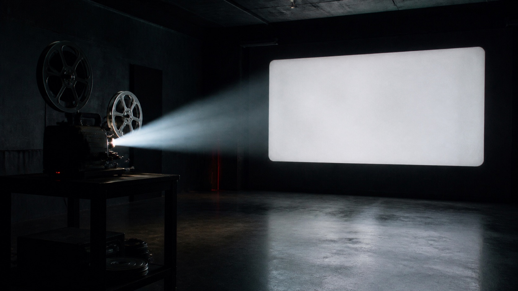
Key takeaways核心要点
- Decide what a title card needs to prepare: genre, pace, distance, or a key question.
- Make hierarchy clear at viewing size before adding decorative type treatment.
- Use title-card motion and duration as part of the opening rhythm.
A title card is often the first promise a visual story makes. Before a character acts or a setting is fully introduced, the card establishes a tempo and a degree of formality. It can feel direct, playful, private, procedural, unresolved, or expansive. None of these effects comes from a typeface alone. They emerge from the relationship between words, space, sound, motion, and the image that follows.
That makes the title card a small editorial problem rather than a branding afterthought. It should prepare a viewer for the kind of attention the next sequence will reward, without claiming more certainty than the work can deliver.
Name the opening contract
Begin by asking what the card should make possible. A compact title over a quiet field may give a viewer a breath before a dense scene. A title that appears after an unexpected image may convert that image into a question. A plain, brief card can signal that the story wants to get to action quickly. These are different contracts, and they imply different durations and visual hierarchies.
In a hypothetical episodic story about two people tracing a misplaced object, the opening card might not need to explain the premise. It could establish a searching rhythm: a fragment of type appears, pauses, then gives way to the first location. The viewer enters with a sense of pursuit rather than a list of information. The following scene must then support that expectation.
Make reading the first priority
Title treatment often becomes more elaborate as visual references accumulate. The basic test remains simple: can a viewer read the primary text at the intended size and pace? Contrast, line breaks, and placement do more for this than ornamental effects. If the title shares the frame with a moving image, the image should not repeatedly undermine the letters’ legibility.
This is not an argument for neutral typography. Expressive type can be appropriate when its behavior serves the contract. A rough edge may suggest handling; a measured reveal may suggest deliberation. But the treatment should not make the title a puzzle unless the story’s opening genuinely benefits from that uncertainty.
Use duration as a story choice
How long a title stays on screen changes its meaning. A flash can function as a marker between modes. A longer hold can turn the title into an invitation to settle into a world. The correct duration depends on what came before and what follows. A card after an intense opening might offer recovery; a card before an immediate cut may heighten anticipation.
Watch the transition at actual speed. Does the title have enough time to be read without freezing the momentum? Does the next image arrive with a relation to the card’s visual logic, or does it feel like a separate asset? Small adjustments to the cut point can matter more than new animation.
Keep the promise proportionate
A title card can create a distinct identity without pretending a small story is an event of guaranteed importance. Avoid gestures that only signal prestige or scale. Use the card to establish an original viewing posture: close attention, quick movement, a pause, or a question.
When it works, the title becomes part of the sequence rather than an interruption before it. It gives the viewer a first set of expectations, then allows the story to complicate them. That is a stronger opening promise than a decorative flourish alone.