Visual Culture视觉文化 · Explainer解读
When Texture Adds Meaning
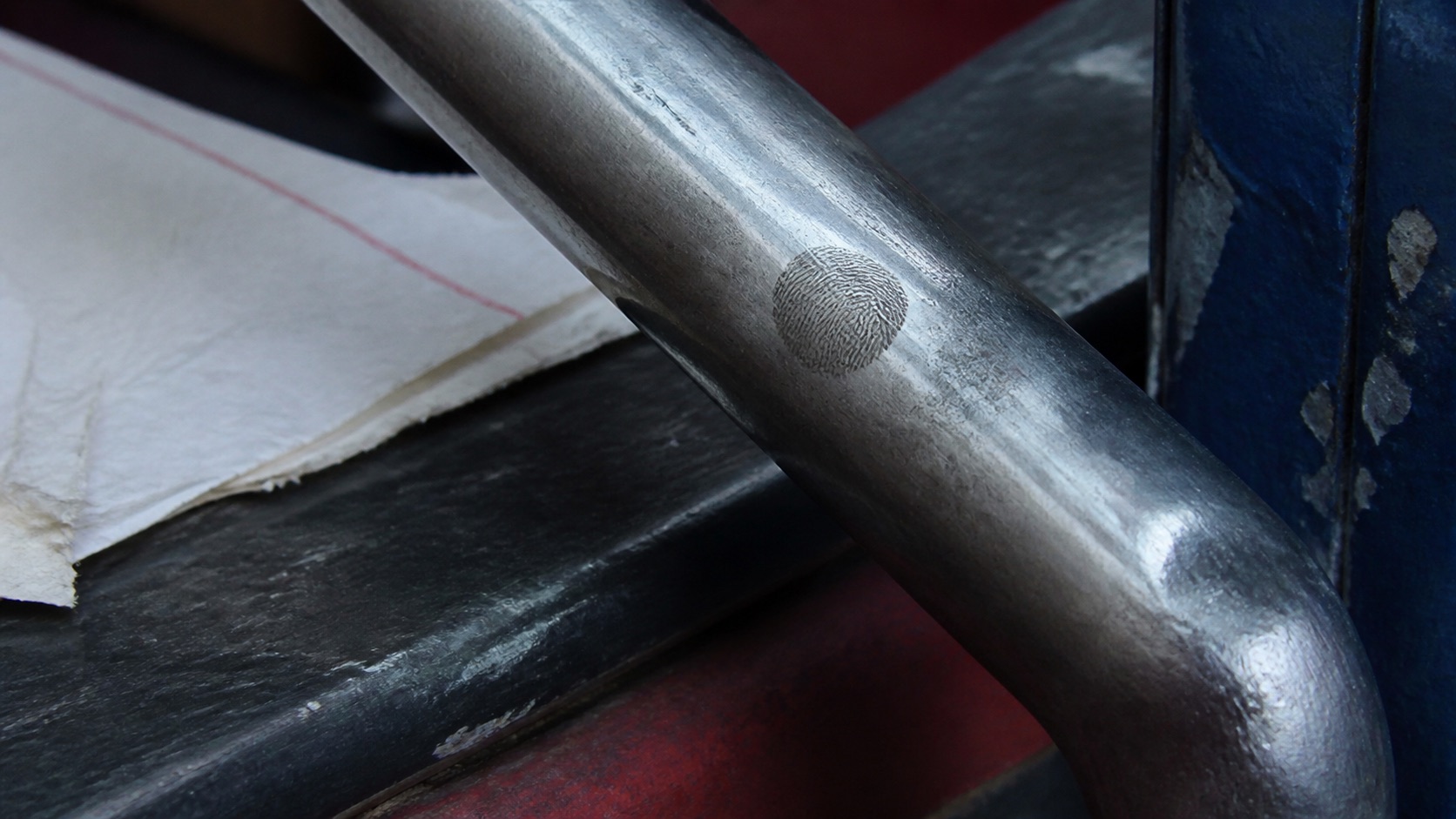
Texture can make surfaces feel handled, temporary, protected, or worn when it follows the conditions of a scene rather than a generic vintage effect.
Key takeaways核心要点
- Choose texture from the material conditions of a setting or interface, not from a default aesthetic filter.
- Use changes in texture to show handling, time, friction, or distance.
- Check that texture supports legibility instead of burying information.
Texture is easy to add and hard to justify. Grain, paper, scratches, blur, and compression can make an image feel less sterile, but they do not automatically make it more specific. Texture becomes meaningful when it suggests a material condition that the story can use: a surface has been touched, a record has aged, a screen is degraded, a space feels porous, or a printed object has passed between people.
The distinction is important because texture changes attention. It can pull an image closer, push it into the past, or make an interface seem unreliable. If that shift is not connected to the scene, the effect may remain a familiar layer placed over otherwise unrelated information.
Begin with the thing being seen
Ask what kind of object or surface the viewer is actually encountering. A photocopied notice, a ceramic mug, a low-light phone display, and a polished table have different material cues. A useful texture choice may intensify those cues or create a contrast with them. In a hypothetical scene, a perfectly clean digital map on a scratched public kiosk could make the map’s promised certainty feel at odds with its setting.
This approach avoids treating texture as a preset. Instead of saying “make it analog,” identify a visible fact: ink has bled, glass reflects fingerprints, fabric catches light unevenly, or a repeated interface card looks worn from use. The technical treatment can then be chosen for the observation rather than for an era or genre label.
Use friction to change the reading
Texture often carries friction. A smooth, quiet surface can make a detail feel controlled; a rough or interrupted one can make the same detail feel contested, temporary, or difficult to access. That contrast can serve a narrative turn. If an image has been visually stable, a moment of compression or noise may make new information feel less secure without declaring it false.
The key is proportion. When every image is distressed, viewers lose the baseline needed to notice a change. Reserve stronger texture shifts for moments when the story needs a different relation to the material. A subtle alteration can be enough if the sequence has already established a cleaner norm.
Protect language and faces
Texture has a practical cost: it can reduce readability. Small type, expressions, and interface states are often the first things to disappear under noise or overlay. Check those elements at actual viewing size. If a viewer must read a line or identify a response, preserve contrast around it rather than assuming atmosphere will compensate.
This is also a question of honesty. An effect that obscures a weak composition does not solve the composition. Remove the texture temporarily. If the intended relation vanishes, clarify the frame first. Add material character only after the image has a coherent visual task.
Let texture remain evidence
The most persuasive use of texture feels like evidence left on an image. It gives the viewer something to observe, then lets the surrounding sequence decide what that observation means. A soft fold in a document may suggest handling; a pixelated edge may suggest distance or limitation. Neither needs an immediate explanation.
Texture is most alive when it is specific enough to invite attention and restrained enough not to become the subject of every frame. It should make the world feel more available to look at, not ask the viewer to admire the filter placed over it.