Streaming Distribution流媒体与发行 · Guide指南
The Value of a Consistent Thumbnail System
A thumbnail system makes a catalogue easier to read by giving each image a role, not by making every image identical.
Key takeaways核心要点
- Define a repeatable focal rule before choosing individual images.
- Prioritise recognition at small size over decorative detail.
- Allow controlled variation for different story tones and episode types.
A thumbnail works under severe conditions. It may be seen briefly, beside many neighbors, at a small size, or with a title partly obscured. Its purpose is not to reproduce a poster at miniature scale. It is to help a viewer recognize a story, distinguish one episode from another, and form an initial sense of tone. A system gives that work a set of dependable rules.
Consistency does not mean every image uses the same face, color, or layout. It means the catalogue has an understandable visual grammar. Viewers learn where titles sit, what kind of image denotes a full series versus an episode, and which marks are meaningful. With no grammar, each card must explain itself from zero.
Set a focal rule
Begin by deciding what must remain recognizable at small size. It may be a central face, a strong object, a clear silhouette, or a recurring place. Avoid designs that depend on tiny text, numerous competing figures, or a plot-specific detail that only makes sense after viewing.
For an imagined mystery set in a coastal town, a recurring lighthouse shape could provide recognition across episodes without turning every image into the same frame. One card might show the building in fog, another its beam across a kitchen window, another a keeper’s notebook. The viewer receives continuity and difference at the same time.
Design for the grid
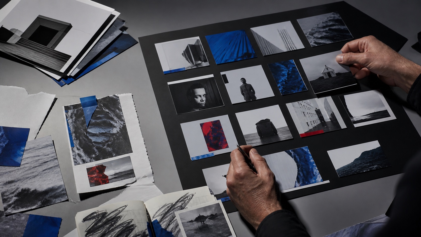
Review thumbnails together, not one at a time. A beautiful image can disappear when surrounded by equally dark images or collide with a neighboring card through similar composition. Build a contact sheet at the smallest likely display size. Look for repeated colors that make unrelated stories look connected, faces that become unrecognizable, and titles that compete with important visual information.
Create a modest hierarchy for special materials. A trailer, bonus, or recap may need a small badge or a different crop, but it should not resemble a required story episode by accident. The system should guide scanning rather than add ornamental labels.
Permit meaningful variation
Rigid templates can erase tone. A comedy may need a more open composition than a chamber thriller; an episode about absence may work better with an object than a portrait. Define the range of acceptable variation: focal contrast, title placement, number of figures, and use of episode numbering. Then apply judgment inside that range.
Finally, test thumbnails without their descriptions. Ask whether a person can tell which cards belong to the same series and which item looks like a sensible place to begin. The answer does not measure artistic quality. It reveals whether the visual system is carrying its practical share of editorial orientation.
Maintain a small reference sheet with approved crops, contrast guidance, and exceptions. It gives later contributors a way to extend the system without copying a single image formula. The reference should explain principles, such as preserving a focal subject, rather than freezing the catalogue into one unchanging visual gesture.
Recheck it when the catalogue grows. A rule that worked for six titles may become unclear when many more stories share the same shelf.